vivovii
Designing Growth, One Habit at a Time
Year
2016 - 2018
Role
UI/UX Designer
Tools
Figma
Sketch App
Zeplin
Adobe Photoshop
Adobe Illustrator

Project Overview
Vivovii was created to make personal and professional growth tangible, actionable, and engaging. Traditional growth tools were often abstract, overwhelming, or difficult to integrate into daily life, leaving users unsure where to start or how to track progress. The goal of this project was to translate behavioral science into a digital platform that empowers individuals and teams to build skills, form habits, and achieve measurable growth across key areas like leadership, communication, and teamwork.
I joined Vivovii as a Junior Graphics and Web Designer and grew into the lead UI/UX designer, responsible for crafting user flows, interactive experiences, and the app’s visual identity. I worked closely with the co-founder, behavioral science experts, and developers to design features like Tip Cards, Insight Cards, Journeys, 360 Assessments, and GrowthOp. My work focused on turning complex personal development concepts into intuitive, motivating, and actionable experiences that users could easily engage with daily.
The platform served both individuals and organizational teams, addressing challenges like unclear starting points, limited time, and fading motivation. By combining iterative testing, workshops, and continuous feedback, we created a product that is not only easy to use but also fosters consistent engagement and measurable growth. Vivovii transformed abstract concepts into daily actions, providing users and organizations with a scalable tool to track progress, build skills, and sustain meaningful development.
The Challenge
Context of the Problem
Personal and professional growth is complex and often overwhelming. Individuals struggle to prioritize skills, stay consistent, and track their progress. Organizations face difficulties supporting employees’ growth at scale, ensuring alignment with team objectives, and maintaining engagement across diverse teams. Existing solutions were fragmented, inconsistent, or hard to apply in daily life, creating a clear need for a platform that made growth structured, actionable, and motivating.
Problem Definition

For individual users, common challenges included:
-
Lack of guidance – Not knowing where to start or which skills to focus on
-
Time constraints – Difficulty fitting growth activities into busy schedules
-
Low motivation – Progress felt invisible without feedback or recognition
-
Information overload – Too much generic advice, making action unclear

For organizational users, challenges included:
-
Difficulty tracking growth – Hard to measure team or employee progress
-
Alignment gaps – Employees’ personal development not always linked to organizational goals
-
Engagement issues – Limited ways to ensure consistent participation in growth programs
These problems were largely qualitative—behavioral, emotional, and workflow-related—but they had tangible impacts: users stalled in their growth, missed skill development opportunities, and organizations faced disengaged teams with untracked progress.
Why It Was a Challenge
Designing a solution for growth was inherently complex because it needed to address two very different user groups at the same time. For individuals, the experience had to feel simple, motivating, and actionable, while still guiding them through abstract concepts like leadership, communication, and self-awareness. For organizations, the platform had to scale, provide measurable results, and allow for team-wide alignment without creating additional workflow friction.
The challenge was amplified by competing priorities: what simplified the experience for individuals could risk losing organizational insight, and features that satisfied organizational metrics could overwhelm or disengage individual users. The design had to reconcile these tensions, ensuring both audiences could achieve meaningful growth without compromise.
Understanding the Impact
These problems directly affected users’ ability to achieve their goals. Individuals often stalled in personal development because they lacked clear direction, motivation, or feedback—leading to frustration, inconsistent habit formation, and a sense that growth was unattainable.
For organizations, gaps in tracking and alignment meant missed opportunities to develop talent, improve collaboration, and foster high-performing teams. Disengaged employees risked lower productivity and morale, while organizations struggled to see measurable ROI from training initiatives.
If left unresolved, these challenges would perpetuate inefficiency, missed learning, and reduced engagement for both audiences. They weren’t just minor inconveniences—they were barriers to meaningful growth that directly impacted users’ lives and organizational outcomes.
Strategic Importance
Addressing these challenges represented a significant opportunity. For individual users, providing a structured, actionable, and motivating growth experience could transform personal development from a vague aspiration into a daily habit. For organizations, a platform that enabled alignment, measurement, and engagement could turn employee development into a strategic advantage, not just a compliance exercise.
Solving these problems had long-term value: it could drive consistent engagement, strengthen user retention, and foster a culture of continuous improvement. By understanding and tackling these challenges, the design could create real impact, helping users achieve meaningful growth while delivering tangible benefits to organizations.
Design Goals
Clear and Focused Experience
Personal growth can feel overwhelming, with endless advice and tools competing for attention. Our primary goal was to simplify decision-making and highlight the most meaningful actions. By creating a clear, intuitive interface with prioritized content, we helped users focus on what truly mattered, reducing cognitive load and increasing adoption. Success meant users could take action immediately without confusion or hesitation.
Balancing User Needs and Business Objectives
Vivovii had two core audiences: individuals seeking personal growth and organizations aiming to develop their teams. Our design goals aligned both needs by providing actionable, measurable experiences that served users while delivering organizational insights. Early trade-offs focused on simplifying the individual experience without compromising organizational tracking or reporting. This ensured design was valued not just as a visual layer, but as a strategic driver for engagement and results.

Designing for Motivation and Habit
Growth isn’t just about knowledge—it’s about consistent action. The design aimed to foster motivation, trust, and habit formation. Features like progress indicators, achievement badges, and interactive prompts were planned to create rewarding micro-experiences that encourage daily engagement. Emotional engagement and usability were central: the experience had to feel empowering, accessible, and inclusive for every user.
Future-Proofing and Scalability
While addressing immediate growth needs, we designed for long-term adaptability. Journeys, Tip Cards, and Insight Cards were built to scale with new content, skill areas, and organizational requirements. Anticipating growth meant the platform could evolve alongside users’ ambitions and organizational priorities without requiring complete redesigns.
Innovation and Differentiation
Vivovii’s experience needed to stand out in a crowded personal development market. The design goals emphasized innovation, simplicity, and tangible action—transforming abstract growth concepts into daily habits. By combining behavioral science with intuitive UX, we created an experience that was uniquely motivating, engaging, and measurable.
Human-Centered Impact
Every goal was grounded in real user contexts. The platform aimed to make growth understandable, actionable, and rewarding. We focused on simplifying complexity, providing clarity, and enabling meaningful progress in users’ daily lives. Ultimately, the design sought to create tools that genuinely improved behavior, habits, and confidence—making personal and professional growth feel achievable and inspiring.
Design Process

Research & Discovery
We began by exploring the problem space to understand both individual users and organizational clients. The focus was on uncovering key pain points, motivations, and behaviors, alongside the business goals the platform needed to support. Research was hands-on and experimental, relying on workshops and discussions with leadership, behavioral experts, and internal testing with our team. These sessions highlighted challenges like unclear growth paths, inconsistent motivation, and difficulty tracking progress. The insights from this stage formed the foundation for user-centered design decisions.

Ideation & Concept Development
Concepting was highly collaborative, bringing together leadership, behavioral experts, the product team, and developers. Together, we translated complex personal growth principles into actionable digital experiences. Ideas were brainstormed, prioritized, and evaluated based on user value, feasibility, and alignment with the platform’s mission. This process produced initial concepts for features, flows, and interactions that balanced innovation with practicality, turning abstract growth principles into tangible experiences.
Prototyping & Validation
Interactive prototypes were developed to explore and test flows, interactions, and usability. Feedback came from leadership, content experts, internal team testing, and occasional sessions with potential users. This allowed us to observe behaviors, validate assumptions, and refine the experience. Iterative testing revealed friction points and unexpected user behaviors, which informed adjustments to layout, navigation, and micro-interactions, ensuring the product was intuitive, motivating, and actionable.
Iteration & Refinement
Design was continuously refined based on insights from testing and feedback. Iterations improved visual hierarchy, interaction flows, and content clarity, reducing cognitive load while enhancing motivation and engagement. This adaptive process ensured that the platform remained aligned with user goals and offered meaningful, measurable growth experiences.
Collaboration & Alignment
Close collaboration was essential to maintain alignment across leadership, behavioral experts, the product team, and developers. Design decisions were validated and iterated with input from all groups, ensuring both scientific integrity and technical feasibility. This approach enabled rapid adjustments while keeping the project focused on delivering impactful, user-centered solutions.
Constraints & Adaptation
The experimental nature of Vivovii required flexibility. Constraints included limited access to external users, evolving behavioral content, and a small team. Rapid prototyping, iterative testing, and informal feedback loops allowed us to adapt quickly while maintaining design quality. This approach ensured the final product was both usable and impactful, even in a dynamic, resource-constrained environment.


The Solutions
Creating Vivovii wasn’t just about building an app—it was about crafting an experience that turns personal and professional growth from a vague aspiration into a daily habit. The challenge was to take complex behavioral science insights and transform them into something actionable, motivating, and easy to engage with.
Our solution focused on three core principles: clarity, consistency, and connection. Every feature was designed to simplify decision-making, encourage users to take meaningful actions, and provide visible progress along their growth journey. Whether guiding individuals through actionable steps or helping organizations track team development, the platform needed to feel intuitive, rewarding, and adaptable to different goals.
The result is a suite of interconnected tools that not only educate but also empower users—turning learning into doing, insights into action, and ambition into measurable progress. Each module was crafted to solve specific user pain points, while collectively forming a holistic growth ecosystem that motivates, informs, and celebrates every step forward.
Tip Cards: Small Actions, Big Results

Why This Feature Exists
Many users struggle with knowing where to start in their personal growth journey. Ambitious goals like improving leadership or teamwork often feel overwhelming without clear, actionable steps. Tip Cards tackle this by breaking growth into bite-sized, achievable actions, helping users take consistent daily steps without feeling lost or overburdened.
Design Requirements & Principles
We determined the feature’s requirements by combining insights from behavioral science with user needs: actions had to be quick to complete, easy to understand, and directly tied to measurable progress. The guiding design principles were clarity, engagement, and motivation. Each card emphasizes the action first, explains why it matters, and provides recommended frequency—all while keeping cognitive load minimal.
Interaction Design & Visual Hierarchy
The interface prioritizes actionable content: the primary step is immediately visible, followed by supporting context. Visual cues such as progress indicators, subtle micro-interactions, and distinct color coding guide attention and create a sense of accomplishment upon completion.

Tip Card Screens
Iterations & Refinements
Initial testing with team members, workshop participants, and friends revealed confusion when instructions were too text-heavy or actions felt vague. Iterations focused on simplifying copy, improving visual hierarchy, and adding small feedback animations to reinforce completion. These refinements significantly increased engagement and clarity.
Contribution to Overall Experience
Tip Cards serve as the daily touchpoint for users, seamlessly integrating with Journeys, Insight Cards, and GrowthOp. They act as the engine of habit formation, ensuring consistent interaction and bridging the gap between learning and action.
Impact & Results
Tip Cards became the primary driver of daily engagement. Users reported a sense of accomplishment from completing even small actions, which reinforced habit-building and long-term progress. From a UX perspective, they lowered friction, increased retention, and demonstrated how micro-interactions can turn abstract growth goals into tangible, motivating steps.
Insight Cards: Knowledge You Can Act On

Why This Feature Exists
Personal growth isn’t just about taking action—it’s also about understanding. Many users struggle to translate abstract concepts, like emotional intelligence or teamwork strategies, into their daily lives. Insight Cards bridge this gap, providing concise, actionable knowledge paired with reflection prompts or self-assessments, helping users connect learning with practice.
Design Requirements & Principles
The feature needed to make complex ideas digestible and engaging. Core principles guiding design were clarity, comprehension, and applicability. Each card presents the key insight first, followed by a short explanation and an interactive prompt. Visual hierarchy, iconography, and subtle color coding were applied to make essential information instantly recognizable.
Interaction Design & Visual Hierarchy
Cards were designed for quick comprehension: headings and visuals highlight the main idea, while supporting content and reflections are secondary. Interactive elements allow users to engage actively with the material, fostering deeper understanding without overwhelming them.
Iterations & Refinements
Early testing highlighted that text-heavy cards were skipped or misinterpreted. We refined copy for brevity, introduced progressive disclosure for additional details, and enhanced visual cues to guide attention. These iterations increased both engagement and comprehension, making learning feel intuitive and actionable.
Contribution to Overall Experience
Insight Cards complement Tip Cards and Journeys by providing context and understanding behind each action. They empower users to make informed decisions about which skills to focus on and reinforce meaningful engagement with the platform.
Impact & Results
Insight Cards became a go-to tool for deepening understanding. Users reported greater clarity on personal strengths and areas for improvement, which guided their actions in Tip Cards and Journeys. From a UX standpoint, they increased retention, built confidence, and created a stronger connection between knowledge and practice, ensuring personal growth was both informed and actionable.
Journeys: Your Roadmap to Growth

Why This Feature Exists
Users often feel lost when trying to achieve personal or professional growth. Without a clear path, they struggle to prioritize skills, plan actions, or measure progress. Journeys provide structured, step-by-step roadmaps that break down complex goals into manageable daily actions, linking knowledge from Insight Cards with practical steps from Tip Cards.
Design Requirements & Principles
The feature needed to balance structure with flexibility. Key design principles were clarity, motivation, and progress visibility. Each Journey guides users along a science-backed path, making steps actionable while showing progress milestones to maintain engagement.
Interaction Design & Visual Hierarchy
Progress bars, badges, and checkpoints visually indicate the user’s journey, helping them understand where they are and what’s next. Steps are short, interactive, and actionable, keeping the experience engaging without overwhelming users. Visual hierarchy emphasizes the current task while providing context for upcoming actions.
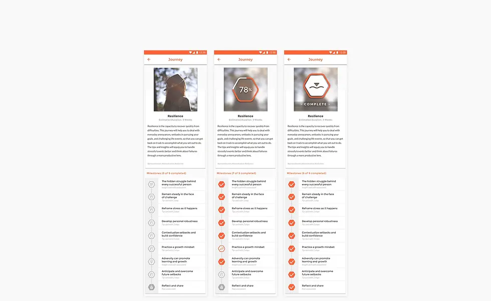
Journey Screens - Milestone Status
Iterations & Refinements
Through user testing and feedback from the team, we refined Journey length, pacing, and micro-feedback. Early versions were too dense, leading to drop-offs; iterative adjustments improved habit formation by balancing challenge and achievability.
Contribution to Overall Experience
Journeys connect all other platform elements into a coherent path. By combining actionable Tip Cards with educational Insight Cards, users experience guided growth that feels achievable and rewarding. Journeys transform abstract goals into tangible, measurable progress.
Impact & Results
Journeys significantly increased daily engagement and long-term retention. Users reported feeling more confident and focused, with a clear understanding of what skills to develop next. From a UX perspective, Journeys reinforced habit formation, maintained motivation, and made growth visible, measurable, and satisfying.
360 Assessment: See the Full Picture

Why This Feature Exists
Self-awareness is a cornerstone of personal and professional growth, but many users struggle to understand how their actions are perceived by others. The 360 Assessment provides multi-perspective feedback, combining self-evaluation with input from peers, managers, or teammates. This helps users identify strengths, uncover blind spots, and make informed decisions about which skills to develop next.
Design Requirements & Principles
The feature needed to be trustworthy, intuitive, and motivating. Privacy, clarity, and actionable insights were key. Visualizations like grids, radar charts, and progress indicators transform complex feedback into digestible, actionable information.
Interaction Design & Visual Hierarchy
Users first complete a self-assessment, then invite colleagues to provide feedback. Aggregated results are presented clearly, emphasizing strengths and areas for improvement without exposing sensitive comments. Visual hierarchy ensures users can quickly grasp insights while exploring details at their own pace.

360 Assessments Screens
Iterations & Refinements
Early iterations focused on simplifying the data presentation. Feedback revealed that too much information at once overwhelmed users, so we refined layouts, added progressive disclosure, and used clear visual cues to guide interpretation.
Contribution to Overall Experience
360 Assessment connects users’ self-perception with feedback from others, informing decisions in Journeys and Tip Card selection. It bridges knowledge and action, helping users develop skills strategically and with confidence.
Impact & Results
This feature enhanced self-awareness, improving personal growth and team dynamics. Users could track progress against peers’ perspectives, leading to more targeted skill development. From a UX perspective, it increased engagement, encouraged repeated interaction, and integrated seamlessly with other platform features, supporting both individual and organizational growth.
GrowthOp: Collaboration That Drives Change

Why This Feature Exists
Sustainable growth doesn’t happen in isolation. Many users struggle with accountability or lack guidance from mentors. GrowthOp bridges this gap by connecting users with coaches and supporters to achieve personal and professional development goals. It ensures structure, guidance, and social support in the growth journey.
Design Requirements & Principles
The feature needed to feel structured yet flexible. Users require clarity on roles, actionable next steps, and visible progress while retaining freedom to adapt. Principles of clarity, motivation, and engagement guided the design, ensuring users understood their tasks and felt encouraged throughout the process.
Interaction Design & Visual Hierarchy
GrowthOp allows users to set objectives, receive guidance from coaches, and gather feedback from supporters. Visual cues, progress indicators, and intuitive workflows help users navigate the collaborative process without confusion. Feedback loops make it clear how actions contribute to progress.

360 Assessments Screens
Iterations & Refinements
Iterative testing helped balance guidance with autonomy. Early prototypes revealed friction in tracking progress and understanding roles, which we addressed by clarifying workflows, simplifying visual indicators, and adding actionable prompts.
Contribution to Overall Experience
GrowthOp transforms isolated efforts into collective achievement, reinforcing accountability and social learning. It integrates with Tip Cards, Journeys, and Insight Cards, creating a cohesive ecosystem for both personal and team growth.
Impact & Results
Users experienced higher engagement, faster skill acquisition, and improved accountability. Coaches could efficiently monitor progress, while supporters actively contributed to the journey. The feature strengthened team dynamics, improved collaboration, and helped users translate learning into measurable action.
Progress & Achievements: Celebrate Every Step Forward

Why This Feature Exists
Motivation often fades when progress isn’t visible. Users struggle to see the impact of daily habits and learning activities. Progress & Achievements transforms abstract effort into tangible results, reinforcing engagement and habit formation.
Design Requirements & Principles
The feature needed to be rewarding without feeling gimmicky. Key principles included clarity, feedback, and motivation. Users should instantly understand what they accomplished, track milestones, and feel encouraged to continue without being overwhelmed.
Interaction Design & Visual Hierarchy
Visual indicators, badges, and progress summaries guide users through their achievements. Color-coded milestones and concise activity logs make it easy to scan personal growth at a glance. Users can drill down into specific actions for more detail, keeping the interface clean and informative.
Iterations & Refinements
Early iterations revealed that overly detailed summaries caused cognitive overload. We refined the hierarchy, simplified visual indicators, and emphasized immediate, digestible feedback. User testing validated that these changes increased engagement and satisfaction.
Contribution to Overall Experience
This feature provides continuous motivation, tying together Tip Cards, Journeys, and GrowthOp cycles. It shows users the direct results of their efforts, making the abstract concept of personal growth visible, measurable, and rewarding.
Impact & Results
Users reported a heightened sense of accomplishment and were more likely to maintain consistent engagement. Teams could track development collectively, fostering accountability and collaboration. Progress & Achievements reinforced habit formation and boosted overall platform retention.
Discover: Explore, Engage, and Unlock Growth

Why This Feature Exists
With a platform offering diverse tools, users can feel lost or unsure where to start. The Discover Page provides a central hub to explore categories tailored to personal or organizational goals, helping users find relevant Tip Cards, Insight Cards, and Journeys quickly.
Design Requirements & Principles
The page needed to be intuitive, goal-oriented, and visually scannable. Core principles included clarity, guidance, and engagement—users should immediately understand what’s available and be motivated to take action without being overwhelmed.
Interaction Design & Visual Hierarchy
Visual cues, concise category descriptions, and interactive previews guide users toward relevant content. Cards are designed for scannability, with subtle prompts encouraging exploration while maintaining focus. Hierarchy emphasizes the most important categories first, helping users prioritize learning paths.
Iterations & Refinements
Early designs were too cluttered, making it hard to navigate. Feedback prompted simplification of layouts, clearer labeling, and progressive disclosure of content. Iterative testing ensured users could naturally explore and select resources that matched their immediate needs.
Contribution to Overall Experience
The Discover Page connects all platform features into a cohesive ecosystem, making exploration simple and rewarding. It empowers users to personalize their growth paths, reinforcing engagement and supporting habit formation across the app.
Impact & Results
Users experienced a smoother onboarding and continuous engagement, easily finding tools to match their goals. Organizations benefited from efficiently surfacing content for teams. The feature increased adoption of all core tools while making learning actionable and enjoyable.
Overcoming Challenges
Building Vivovii was an ambitious endeavor, and our team faced multiple challenges that shaped both the process and the product.
Limited Resources and Time Constraints
Challenge: As a small, agile team, we had to deliver a robust product with limited manpower and tight timelines, balancing multiple priorities simultaneously.
Solution: Features were prioritized based on impact, and we focused on building MVPs for core functionalities first, iterating gradually based on feedback from the CEO, COO, and internal testers.
Translating Complex Behavioral Science into a Digital Experience
Challenge: The content was grounded in behavioral science and psychology, which made it difficult to translate into actionable app features without losing accuracy or effectiveness.
Solution: We collaborated closely with behavioral experts, continuously testing prototypes with internal team members and early clients to ensure concepts were clear, actionable, and engaging.
Cross-Functional Alignment
Challenge: Coordinating between leadership, content experts, the product team, and developers sometimes created conflicting priorities, from scientific accuracy to technical feasibility and UX considerations.
Solution: Frequent workshops, brainstorming sessions, and iterative feedback loops ensured alignment while maintaining flexibility to adapt to new insights or constraints.
Experimental User Testing
Challenge: Access to external users for testing was limited, making it hard to validate assumptions and refine features with broad input.
Solution: We relied on experimental testing with internal team members, friends, and occasional early clients, iterating quickly based on observations and informal feedback.
Key Takeaways
Overcoming these challenges strengthened the team’s ability to innovate under constraints, iterate quickly, and maintain user-centered thinking while balancing scientific rigor and technical feasibility. These lessons shaped not only Vivovii’s design but also how the team approached future projects.
Sustaining Engagement and Cohesion
Challenge: Keeping the team motivated and coordinated over a complex, experimental project required careful communication and shared vision.
Solution: Regular check-ins, collaborative decision-making, and emphasizing the mission of empowering growth helped maintain momentum and focus.

Impact & Results
During my time at Vivovii, I designed and refined key features that turned abstract personal growth goals into actionable, measurable steps. My work laid the foundation for the platform’s core experience, including Tip Cards, Insight Cards, and guided Journeys. Early testing with internal teams and select users indicated increased clarity, motivation, and engagement, demonstrating the potential for consistent habit formation.
I also contributed to prototypes of 360 Assessments and GrowthOp, enabling early exploration of team skill tracking, feedback loops, and collaboration. Feedback from these sessions helped shape the platform’s approach to organizational growth, highlighting how users could better understand strengths, gaps, and progress.
While the product continued to evolve after my departure, the frameworks, interactions, and design principles I established set the stage for scalable growth, user adoption, and behavior-driven engagement. Early indicators showed that thoughtful design could improve clarity, motivation, and usability—foundations that would support the platform’s long-term success.
Reflection & Key Learnings
Working on Vivovii was a crash course in designing for behavior change and complex user needs. The project challenged me to translate abstract personal growth concepts into actionable, intuitive digital experiences, sharpening my ability to think strategically while staying user-centered.
I learned the value of collaborating closely with cross-functional teams, including leadership, behavioral experts, and developers, to align on vision, feasibility, and user impact. Iterative experimentation—even in informal testing settings—taught me that small, data-informed refinements can dramatically improve engagement and usability.
This experience reinforced the importance of empathy, adaptability, and evidence-driven design, as well as the power of creating frameworks that support long-term scalability. Looking back, I would invest even more in structured user research early on, but the lessons from navigating ambiguity and making design decisions under constraints continue to influence how I approach projects today.
Vivovii shaped my philosophy as a designer: design is not just about interfaces—it’s about guiding behavior, enabling meaningful outcomes, and creating systems that scale human potential.